Create custom Azure Workbooks for detailed monitoring
Categories:
3 minute read
Introduction
Azure Workbooks are a powerful way to build customizable dashboards for monitoring applications and infrastructure. They can combine multiple data sources such as:
- Metrics
- Log Analytics Workspaces
- Visualizations
They are flexible enough for quick performance overviews or deep investigations.
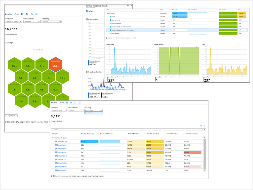
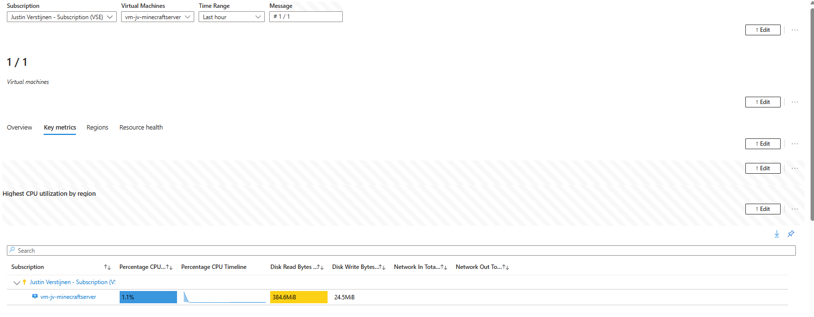
Using Default Azure Workbooks
Many Azure resources include built-in workbook templates with basic health and performance insights.
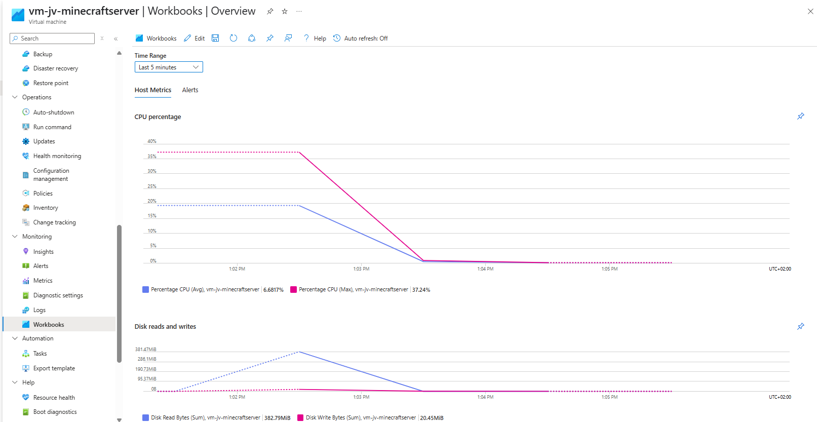
- Open your Virtual Machine.
- Select Workbooks.
- Choose Overview or another template.
Workbook Templates and Examples
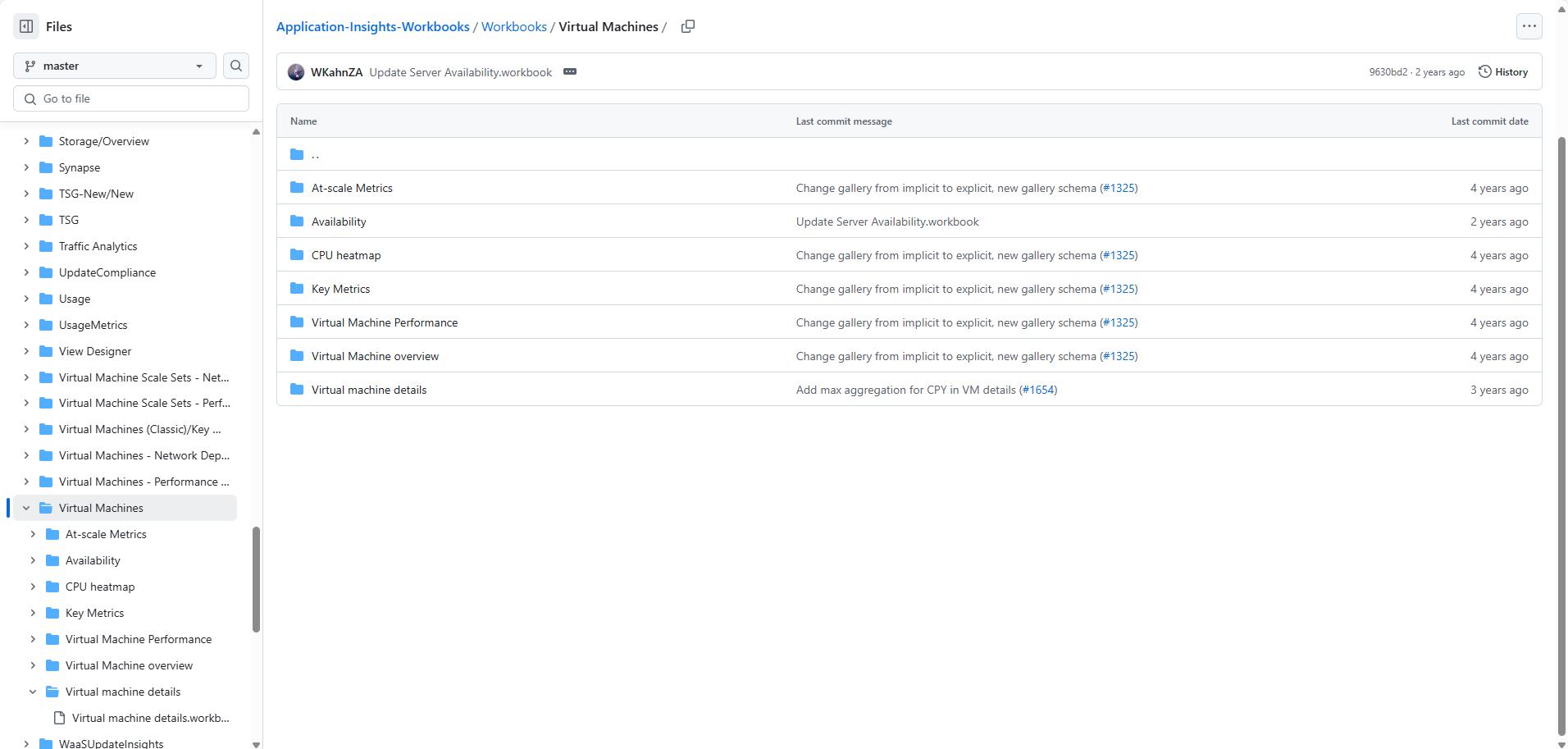
Microsoft maintains a public repository with workbook templates:
This library contains hundreds of ready-to-use workbooks that can also be reused in your own custom dashboards.
Import a Predefined Workbook
Create a new workbook in Azure and open the Advanced Editor to paste workbook JSON from GitHub.

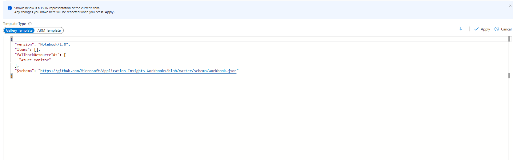
After applying the JSON, the workbook becomes available in your tenant.
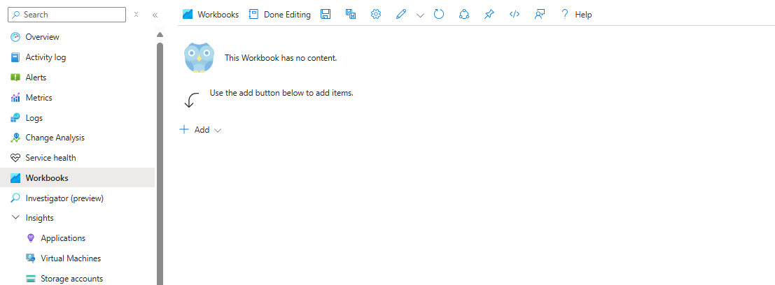
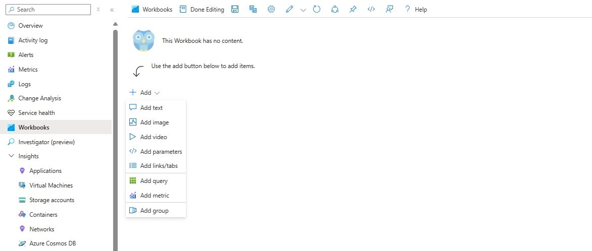
Build Your Own Custom Workbook
Useful building blocks:
- Parameters – filters, selectors, dynamic views
- Queries – KQL queries against Log Analytics
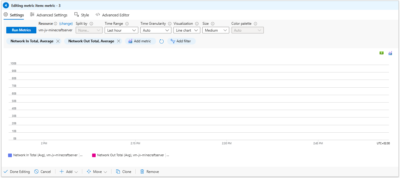
- Metrics – CPU, memory, disk, network
- Groups – combine components into sections
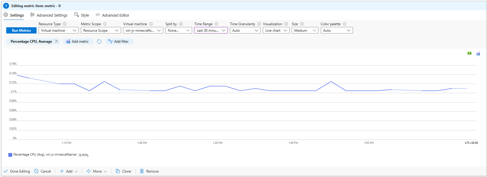
Add CPU Metrics
Create a new metric tile:
- Resource type: Virtual Machines
- Scope: select one or more VMs
- Metric: Percentage CPU
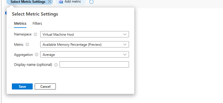
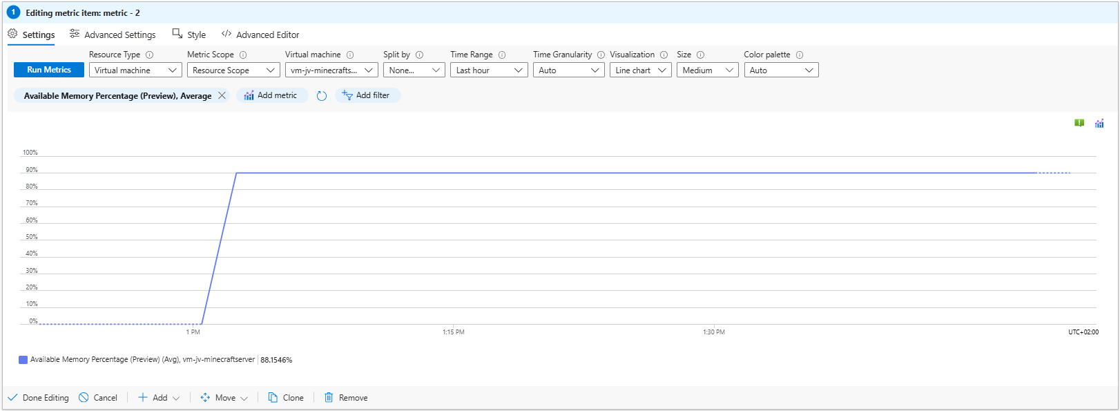
Add Memory Metrics
Use:
- Available Memory Percentage
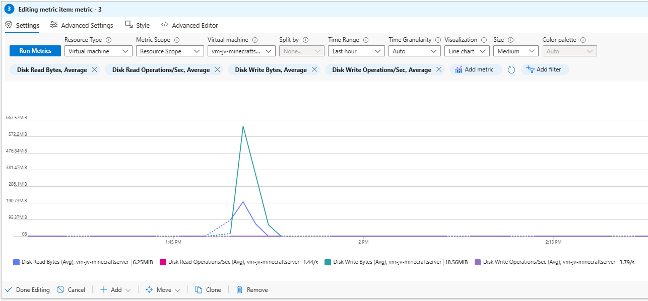
Add Disk Metrics
Recommended metrics:
- Disk Read Bytes
- Disk Read Operations/sec
- Disk Write Bytes
- Disk Write Operations/sec
Use Average aggregation.
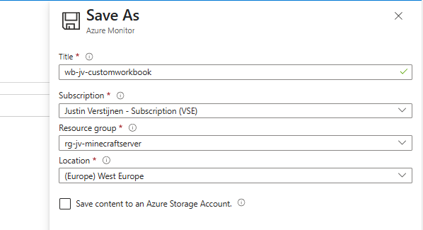
Save the Workbook
Store workbooks in a dedicated monitoring resource group or alongside the application.
Improve Visualizations
Add Titles
Use Advanced Settings to define chart titles.
Tile Order and Size
Reorder tiles and set width percentages (for example 50%) to create two-column layouts.
Use Bar Charts
Bar charts are often clearer than line charts for quick health checks.
Grid View for Operations
Grid views are ideal for incident response and multi-VM overviews.
Add conditional formatting such as:
- CPU: Green → Red
- Memory Available: Red → Green
Round percentages to zero decimals for readability.
Download Example Workbook
You can download the original sample workbook here:
Summary
Azure Workbooks provide a flexible and scalable way to visualize operational data in Azure. Start with templates, then evolve toward dashboards tailored to your own workloads.
Thank you for reading this post and I hope it was helpful!
End of the page 🎉
You have reached the end of the page. You can navigate through other blog posts as well, share this post on X, LinkedIn and Reddit or return to the blog posts collection page. Thank you for visiting this post.
If you find this page and blog very useful and you want to leave a donation, you can use the button below to buy me a beer. Hosting and maintaining a website takes a lot of time and money. Thank you in advance and cheers :)

The terms and conditions apply to this post.